Studio m³
Naming und Logoentwicklung
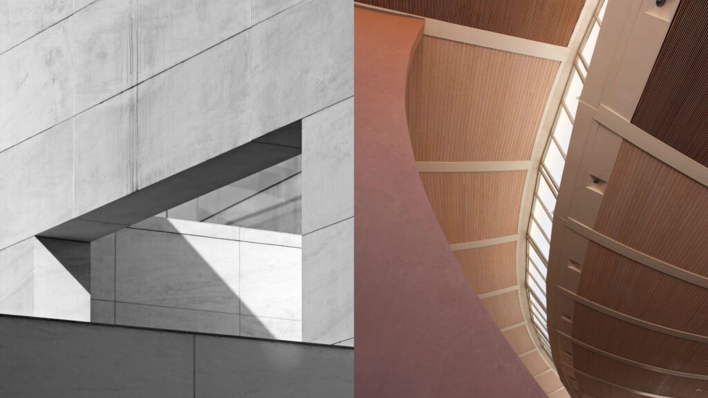
The office focuses on both urban development and architecture, seeing both as equal, interdependent elements. They think about the architectural details and implementation in urban development, just as they always keep the urban planning aspects in mind in architecture. The focus is on spatial formation and atmospheres, the boundaries between public and private and the appropriability of the projects.
The projects arise as a symbiosis of the task and the specific conditions of the location. They are highly contextual and characterized by a distinct individual identity, offering timeless solutions to the complex needs of the city and appealing to the senses. The aim is to create added value not only for the project, but also for the neighborhood. With every project anew.
Studio M³ embodies the bridge between timelessness and modernity in architecture, a synthesis that is at the core of their design philosophy. Their view of design processes is integrative, and they create living living spaces that reflect the duality of architecture in all its depth.
The heart of the visual concept is the logo. The integration of a changing number from 1 to 9 not only highlights the diversity of the performance phases in architecture, but also adds a contemporary and innovative accent. The clear lines and geometric structure of the logo symbolize the elegance and precision of Studio M³.
The carefully chosen color palette not only creates aesthetic harmony, but also conveys Studio M³’s core values in every visual element. Characterized by a balanced interplay between timeless elegance and modern dynamism, they underline the complexity of Studio M³’s architectural philosophy.
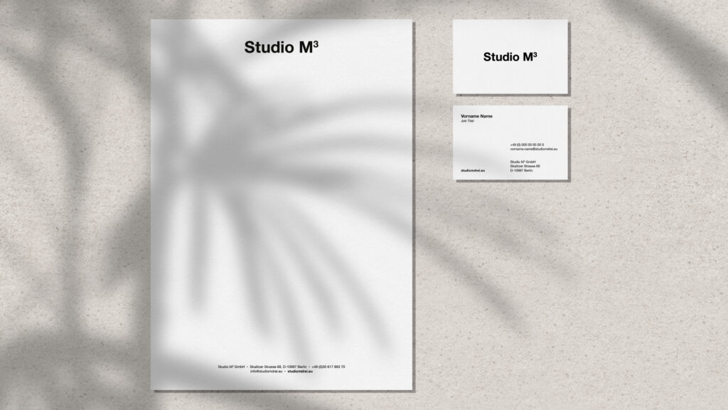
The decision to use the timeless font Helvetica was made consciously. Helvetica embodies clarity and modernity, which fits Studio M³ perfectly. This font choice was used consistently throughout the business stationery.
From business cards to stationery to digital applications – Studio M³’s visual identity has been consistently applied to all business equipment. This ensures a consistent and professional appearance in every interaction with customers and partners.
From coming up with a name to creating a comprehensive style guide, we shaped Studio M3. The result is not just an architectural office, but a living work of art that combines the past and the future. Studio M3 – the successful synthesis of timeless elegance and modern dynamics.

